Ferrari Hasn’t Learned the Jaguar Lesson
28/05/2026 | Lee Taylor
By · 22/08/2025 · 7 min read
Editor’s note: In a rare victory for common sense, Cracker Barrel has since reversed course, announcing that it will restore its original logo after widespread customer disappointment with the redesign.
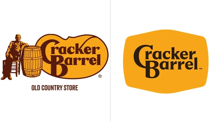
Cracker Barrel, a restaurant chain loved for its comforting Southern staples, has recently divided consumers following the redesign of its iconic logo. Proudly representing its image since 1977, the original logo displayed a man in rustic workwear reclining beside a large barrel, with the words “Old Country Store” written beneath. Whether he was intended as a customer, a staffer, or simply an archetype of Southern gentility, the imagery spoke to tradition and familiarity.
As the young restaurant chain grew in popularity, it became an appealing food destination for highway travellers who appreciated its traditional Southern menu. The logo – the first visual anchor of the customer journey – encapsulated its offering perfectly: a celebration of Southern charm, paired with clear text that spelled out exactly what it was. For Baby Boomers and early Gen X travellers of the 1970s, often encountering the South from behind a car window on long interstate drives, this clarity mattered.
Now, many successful decades later, Cracker Barrel has unveiled a new logo – a change that no one was really hoping for, nor anticipating. And yes, to no surprise, it has lost everything that made it distinctive. The rustic figure, the symbolic barrel, and the clarifying strapline are all gone. What’s left is a plain, bland logo that simply reads “Cracker Barrel”. To an uninitiated customer – particularly tourists seeking out Southern staples – it could be almost anything: a brewery, a hardware store, even a sporting goods retailer. Notably, in 2023, Cracker Barrel reported that around 30% of its foot traffic came from travellers and tourists rather than locals. If distinctiveness drives discovery, one has to wonder whether footfall will suffer.
Cracker Barrel’s Chief Executive Officer, Julie Felss Masino, proudly gushed about the rebrand on Good Morning America this week. She explained, in a tone that felt strangely detached from the chain’s roots, how the business gathers its managers in Orlando “once every other year” and that the “feedback and the buzz is so good, not only from our customers but from our team members.” Really? With its restaurants scattered across the Southern states and Midwest, I, like many, find it surprising that its audience would have been as delighted as she describes. These are regions where tradition isn’t just tolerated but celebrated – from small-town parades to porches draped with heirlooms of local identity. If customers can embrace symbols far more provocative than a man with a barrel, they can certainly handle a logo that leans into Southern charm.
That’s what makes this shift so tone-deaf. For decades, Cracker Barrel leaned into imagery that reflected its own customer base – people drawn to homestyle food, regional character, and yes, a sense of rootedness. By stripping away those cues, the chain isn’t modernising; it’s alienating.
The graveyard of logos that once weren’t afraid to embody their heritage is becoming increasingly crowded. Take Uncle Ben’s – once a kitchen cupboard staple in millions of households across the world. Many of us recall its commercials from childhood, where Uncle Ben himself stood as the comforting face of the brand.
In the age of Peak Woke, heavily influenced by the Black Lives Matter movement, Mars – the owner of Uncle Ben’s – made the decision to remove him entirely. The argument was that his image perpetuated stereotypes of servitude and racial injustice. Thus, the brand became Ben’s Original in plain blue text, stripped of character and recognisability. Bland and safe, like Cracker Barrel’s rebrand, it could be selling almost anything.
Another brand that has also been sacrificed to the blue-haired guardians of progressivism was Aunt Jemima, beloved for its pancake mix and syrup. In 2021, amidst heightened racial unrest, the brand discarded its iconic figure and reinvented itself not with a name that evoked indulgence or nostalgia – such as “Sunday Brunch Table” or “Golden Syrup Co.” – but as the “Pearl Milling Company.” For all most consumers care, that could be a gravel manufacturer or a plastics supplier.
Lying alongside Aunt Jemima and Uncle Ben in the branding graveyard are Land O’Lakes, which removed its Native American imagery in 2020, and sports franchises such as the Washington Redskins and Cleveland Indians, forced into uninspired renames under political pressure.
And more will surely follow. Despite the faintly hopeful tremors caused by Sydney Sweeney’s American Eagle campaign or Gavin Casalegno’s short and sweet commercial with Dunkin – both defiantly non-conforming in tone – we sadly remain stuck in marketing’s Woke Age.